Tuesday, February 15, 2011
D&Print
My design idea was a koi fish and an Asian symbol for spirit. I chose the koi fish because I originally have in mind this wooden statue of a goldfish that my grandparents brought back from Okinawa but then I realized that even if I drew it from my view of it as a still life, I would feel like I was copying/ taking the carver's idea/creation. I started thinking about something else I could do but all I could think of was a fish. My choice was also somewhat shaped by my parents life of travel when they were little. My dad traveled the world when he was young because his father believed that people should experience as much of the world as they can before they get 'tied down'. My mom traveled mostly throughout the U.S. and Asia because her mom and dad were in the military so they got to move around with him and live on base. Now, since they both moved around so much when they were young, they want to settle down, aka: no big trips for me or my brother and sisters, so I thought I'd draw something from a place I want to visit. I can't believe I'm saying this, but my inspiration was mainly food. I had been very hungry at the time and was talking with my table partners about our favorite restaurants when Chinese and Japanese buffets came up and then I remembered that most asian restaurants are where there are the huge tanks of fish and decided I'd draw one of those fish-a koi fish. The only color I'm absolutely set on is my 1st color, celedon, because I absolutely love that color. I was 1st introduced to it in cereamics and it quickly became my favorite glaze along with moss green, its a color that's in the ocean but you only see it on rare occasions. I'm expirimenting with my second color but so far the ones that look the best are a dark grey/blue and a maroon w/ a purple tint, dark colors look the best, ligh colors make it difficult to focus on the print. I was going to make my 3rd color a black-outlining the fish's scales and fins- but I'm not sure if I'll even add it anymore because they already look pretty cool without the black.
Friday, February 11, 2011
D&Paint
I need to work on adding more shading to skin because in the picture it kind of flows together but as i paint it, you can't tell the difference without looking at brushstrokes. I'm having trouble figuring out how to paint her shirt because in the picture she's wearing plaid. I've started with the base color of the plaid which is a light blue but when i went on to paint the stripes on it, the shirt looked ridiculous..and still does :) any advice on how to paint plaid?
Thursday, February 10, 2011
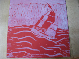
D&Print-lino reduction prints
In class we've moved on to reduction prints and I have to say it's really super nerve-wracking. The main deference is with just a regular lino stamp you can reuse it as many time as you need but with a reduction stamp you have a light color that you use with a general shape carved into the lino and then for the next color/step you have to carve some of your lino away which means if you screw up you are royally screwed. I'm working on carving for my second color (I'm carving a koi fish)..I was so nervous about running out of the 1st color that I mad 20 copies.....still not sure about having enough haha! So earlier today in my d&print class I was carving my lino and I slipped and cut myself, it hurt like crazzy!!I didn't even look at it, I just grabbed paper towel and wrapped my finger and squeezed because it hurt so much, and when I finally got a band-aid on it I had to change it because it bled through. I laughed the whole time :)
Monday, February 7, 2011
D&Print-done with 1st lino project =)
I am happy I survived my 1st linoleum project and honestly, if I had taken 1 more day on it, my lino would be in around 5 separate pieces. Oh well, enjoy!!


 |
| This is my poor cracking lino, and this was taken 2 weeks ago, there are even more cracks in it now :( |


 |
| This is actually one of my favorites because -when you look at this print in person- the purple is lighter and goes very well with it's lime green background, the coloring is off on this pic. |


Please comment on which is your favorite and/or different things you would have done :)
D&Paint
Well last week we had only 3 days of school (due to snowdays) and in that time I repainted the skin with a color much closer to her natural tone and I worked on painting her lips. Natural lip color is another one of those colors that changes from person to person and one that I struggled to create. Today I might try making a better color.
 |
| I think I need to work on shading a little more when it comes to her skin and I might add some pink in with her tome because at the moment she seems pretty pale. That might be due to the background but I wanted the nice, sunny, yellow since it reflects her cheerful, outgoing personality, though i might tone it down a little. -What do you think? |
Subscribe to:
Comments (Atom)